One pen, eight exercises, one first word
Brush Calligraphy for Beginners: Basic Strokes and a First Word
Use light pressure when the pen travels up and more pressure when it travels down. Then lift the pen between shapes. Those two habits are the starting point for brush calligraphy—and for the little word “hi” you’ll build in this lesson.
You’ll practise with a small flexible brush pen, learn where the pressure changes happen, and turn three shapes into two letters. This is a modern Latin brush-pen lesson. Pointed-nib calligraphy and other brush-writing traditions need their own instruction.
- First project
- The word “hi”
- Main supplies
- One small brush pen and smooth paper
- Look for
- Light upstrokes, thicker downstrokes, even heights
- Practice aid
- A printable stroke-and-word sheet
Start with one pen and paper that suits it
- One small flexible brush pen. Choose a brush tip, rather than a rigid fineliner or a broad, chisel-shaped marker. You need the tip to change width with pressure.
- A few sheets of smooth, pen-compatible paper. Smooth tracing paper is useful if you want to place it over the practice sheet. Test a small area for bleeding or smearing before filling a page.
- A pencil and ruler. Use these for guide lines if you aren’t printing the sheet.
- A flat desk with good light. Leave room for your hand to move across the page.
A price reference, rather than a tested recommendation: Tombow’s US listing for one black hard-tip Fudenosuke brush pen, SKU 82038, showed US$4.15 on 19 November 2026. That excludes paper, tax and shipping; price and availability can change. You don’t need a colour set to try the exercises.
For this pen, Tombow recommends smooth, non-textured paper, including marker and tracing papers. Keep ordinary printer paper for the master underneath a suitable tracing sheet.
Find two different line widths before writing letters
Rest your forearm comfortably and loosen your grip. Tilt the pen enough for the side of the flexible tip to meet the page; don’t jab straight down on its point. Turn the paper until you can move comfortably. There isn’t one compulsory grip angle for every hand.
Tombow’s pressure-and-position lesson explains the basic contrast: light upstrokes, heavier downstrokes. On a scrap of suitable paper, make three light upward lines, then three downward lines with a little more pressure. Increase it only enough to see the tip flex and the line widen. Don’t crush the tip.
Your first check is simple: can you tell the two widths apart? The upstroke needn’t be as fine as a printed diagram. If every line is thick, ease off before changing your letter shapes. If holding the pen becomes uncomfortable, pause and adjust rather than gripping harder.
Four guide lines give the shapes somewhere to land
The baseline is where the main body of a letter sits. The waistline marks the top of a short letter such as “i”. The gap between them is the x-height. An ascender line gives a tall loop such as the top of “h” a ceiling; a descender line gives a loop below the baseline room to turn.
The sheet below uses a suggested 10 mm x-height, with another 10 mm above and below. These generous dimensions are an editorial starting point, not a rule for every pen or script. Pieces Calligraphy’s loop lesson also notes that guideline ratios can vary. If your tip is much larger, draw larger guides instead of squeezing it into these spaces.
Eight exercises that prepare you for letters
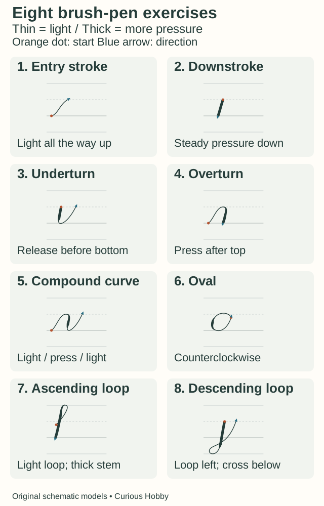
Practise each shape separately and lift the pen when it ends. The Pieces Calligraphy stroke series demonstrates this way of building letters. Teachers group the basics differently; these eight exercises are the set used in this guide, not an official count for all calligraphy.
1. Entry stroke and 2. downstroke: separate light from heavy
For an entry stroke, travel from the baseline toward the waistline with a gentle curve and light pressure throughout. For the downstroke exercise, set the tip down with comfortable pressure and pull toward the baseline. Keep the width steady. We’re using a short version between the waistline and baseline.
3. Underturn: release before the bottom
Make a U shape. Begin at the waistline with a thick downward stroke. Ease off before reaching the baseline, round the bottom lightly, then rise with a thin stroke. If the bottom becomes a heavy blob, the release probably came too late. See the pressure transition in Pieces Calligraphy’s underturn lesson.
4. Overturn: add pressure after the top
Start at the baseline and rise lightly into an upside-down U. Curve over at the waistline, then increase pressure as the pen comes down. Keep the top light; pressing while still travelling upward makes the arch bulky. The overturn demonstration shows that order.
5. Compound curve: put both turns together
Rise lightly, round the upper arch, press on the downward section, release before the lower turn, then rise lightly again. Think light–press–light, with the pressure changes happening on the downward section. This compound-curve lesson breaks down the transitions.
6. Oval: close the shape without a thick join
Start near the upper right, just below the waistline. Move counterclockwise: lightly up and left, press as you come down the left side, release before the bottom, and return lightly up the right. Aim for a closed shape whose join doesn’t stand out. Follow the oval demonstration if the direction is hard to picture.
7. Ascending loop: make room for the tall part
Start around the waistline with a light rising curve. Loop up to the ascender line, turn, then press as you descend to the baseline. Keep a small opening inside the loop. The ascending-loop demonstration shows the thin beginning and heavier downward stem.
8. Descending loop: go below the baseline
Start at the waistline with a thick downward stem. Continue below the baseline, release before the bottom of the loop, then curve left and back up lightly. Cross the stem below the baseline and finish toward the waistline. See the descending-loop demonstration for the crossing point.
For a first pass, make three of each shape and compare them. Circle the clearest one and name what worked: “lighter turn” or “same height”. A short row you examine gives the next attempt a purpose.
Print a master, then trace on suitable paper
Download the original brush-calligraphy practice sheet (SVG). It contains the eight models, guide lines, a “hi” example and blank space. Open the file in a browser to print it.
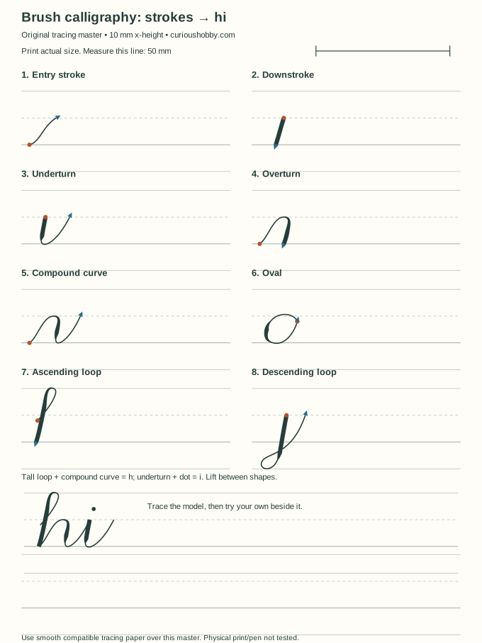
- Choose A4 or US Letter, portrait. Print at 100% or actual size, with browser headers and footers off. The artwork is 180 × 240 mm.
- Measure the calibration line: it should be 50 mm. If it isn’t, check scaling before using the printed dimensions.
- Print the master on paper approved for your printer. Place smooth, brush-pen-compatible tracing paper over it and secure it so it won’t slide. Only feed specialty paper through a printer if its instructions allow it.
- Trace a model, then try it in the blank space beside it. Keep your wet ink clear of your resting hand and let it dry before moving the tracing sheet.
The sheet’s digital dimensions have been checked; we haven’t tested a physical print or pen on it. If printing is inconvenient, pencil in the four guide lines on suitable paper and use the on-screen models.
Build “h”, add “i”, then join them
Connected lettering doesn’t require one unbroken pen movement. Lettering Daily’s beginner stroke lesson explains how individual shapes and pen lifts build letters. For this simplified “hi”, use the following sequence.
- Make the tall part of “h”. Draw an ascending loop down to the baseline. Lift the pen.
- Add the shoulder. Start at the foot of that stem and draw a compound curve: light up to the waistline, heavier down, light through the bottom and up again. Now you have an “h”. Lift.
- Make “i”. Where the thin exit reaches the waistline, begin an underturn: heavier down, release, then light up. Lift and add a small dot above it, leaving a visible gap.
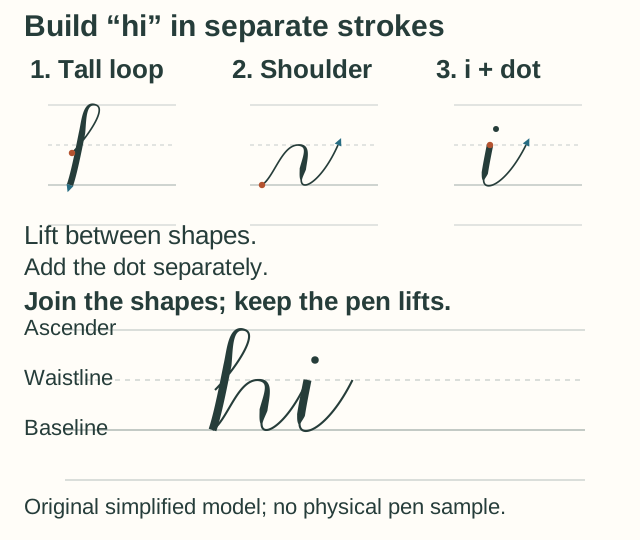
Write it three times, leaving a gap between words. Check that the shoulder of “h” and the top of “i” reach the same waistline, the two lower turns meet the baseline, and the downstrokes are visibly heavier. If the join looks cramped, leave a little more horizontal room on the next attempt. You can practise the letters separately before trying the join again.
When the pen won’t do what you expect
- The upstrokes are as thick as the downstrokes.
- Return to separate lines. Use just enough contact to leave a mark on the way up, then a little more on the way down. Check the pressure contrast before attempting another word.
- The bottom of every U is heavy.
- Begin releasing earlier, while the pen is still moving downward. Practise only the underturn until you can round the bottom lightly.
- The pen catches, or the edge of the line looks fuzzy.
- Check for textured paper, excessive pressure or a damaged tip. Try a fresh patch of smooth compatible paper with a lighter touch. Don’t press harder to force a sharp line.
- The letters keep changing height.
- Use the waistline and baseline as checkpoints. Repeat one shape between those lines before combining it with another. Don’t change letter size and pressure at the same time.
- The wet ink smears.
- Test drying on a scrap of the same paper. Change the page position or working area so your hand stays clear of fresh marks, especially when writing left-handed. Tracing and marker papers can dry differently; Tombow’s linked paper lesson flags smearing as something to watch.
- The lines wobble.
- Shorten the exercise, relax your grip and move deliberately. Look for a clearer pressure change rather than a perfectly smooth edge. Compare a few strokes before filling another page.
Next time, choose one shape that caused trouble, make a short row, then write “hi” again. Keep the earlier row so you can compare the same feature. This is a suggested practice exercise, not a tested schedule or a promise of fast progress.
Once you like a greeting, you could pair it with the quilled flower-card project. Practise the lettering on scrap first, and write on the flat card before attaching raised paper pieces. If pen work doesn’t appeal, the at-home hobby list gives you other small-space options.
How this guide was prepared
Curious Hobby used AI assistance to research, draft and illustrate this guide. The pressure and stroke instructions were checked against the maker and instructor resources linked beside them. The diagrams, simplified word model and worksheet are original editorial aids. We haven’t tested the pen, practised these exercises hands-on, or tested a physical print. No personal results or handwriting improvements are claimed.